By Monika Swiderska, Excalibur Speakers, Div L Area9
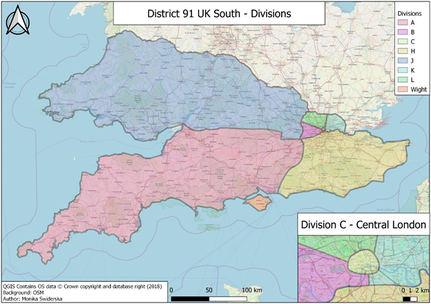
Figure 1 A map of District 91 UK South
We live in a data-driven world. In the era of social media, online collaboration and internet. The information we are surrounded with plays bigger and bigger factor on how companies and organisations operate, and individuals live their lives. And most of that information is spatial, which means it can be put on a map. When you post a fancy picture of your favourite meal, you can tag you are in the local restaurant in Twickenham. When you are visiting your relatives in the countryside, you can mention that you are in the middle of Essex. And even if you are stuck on Central Line, you can post that you are in Tottenham Court Road station.
Toastmasters is not very different in that regards. We have an enormous amount of data. Data, that is location-bound and can be put on a map. If we think about our clubs, we immediately relate them to a location. A lot of them even draw their names from a place, for example: Covent Garden Speakers, Holborn Speakers or Ludlow Toastmasters. The clubs also have addresses, so we can easily put them on a map. And then, ask some questions. Where are most of the clubs located? Are they in busy business districts like City of London? Or perhaps in a cosy neighbourhood on the border of M25? How they are doing in terms of Distinguished Club Program points and membership base? Can this data tell us a story?
Being a Geographic Information Science Specialist, I look for answers for similar questions in my day-to-day job. But I am also a keen Toastmaster and I thought that with my GIS skills, I could help District 91 understand the spatial data better.
An immediate choice was helping with district realignment. Each year District Alignment Committee is tasked with aligning existing and new clubs based on their geographic proximity in order to maintain the strength of areas and divisions. That is a long process of analysis, discussions and consultations. The final proposal is then presented to District Council and voted on. This year, for the first time, the maps used by District Alignment Committee have been created using a professional GIS software called Quantum GIS (QGIS).
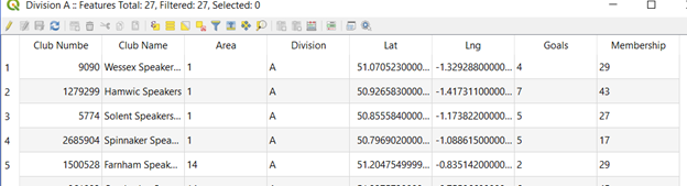
GIS is a powerful visualisation tool, but it can be so much more. It is capable of storing multiple layers of information. In case of our clubs, before the data was visualised spatially, the Distinguished Club Program points and membership bases were added to the software. This helped District Alignment Team to understand the situation of the clubs better, but it also started to paint a spatial story.
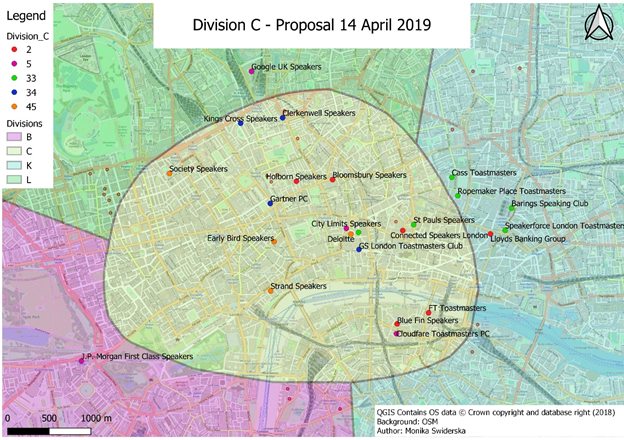
The District leaders have always known that there are locations with bigger density of clubs like London (or in particular Canary Wharf) and locations where Toastmasters International is unheard of. Furthermore, there are areas where clubs do particularly well and places where they struggle. With the use of GIS we can start to quantify that information and try to spot patterns. However, that is just a step away from a colourful visualisation or a map. GIS is a science that is not far from Data Science. Thus, the analysis of clubs’ locations, population densities of towns and wards and overlaid transport links can draw an even more robust picture of our District and help us play to the advantages of our geography. This initiative is an ongoing project called “Atlas” and it is my High Performance Leadership project. As with every innovation project, it is full of trials and errors. However, so far it has been an amazing journey, in which I could link my two passions together. I am hoping that by the time I finish, I will be able to share my passion for maps and understanding of spatial data to tell a better story of clubs and members in District 91. So that, in turn, would help the District leaders to serve their members better.
Hi
This is wonderful
At out COT we asked if we could do an extract of why people wanted to join a Toastmasters club.
We could then look at demographics and other factors to help us perform better targeted marketing
Is this something you could do?
We could use Survey Monkey, or build a page on our website to ask current members across D91 (and further afield)
Our biggest challenge is ‘How to attract members to a rural club?’