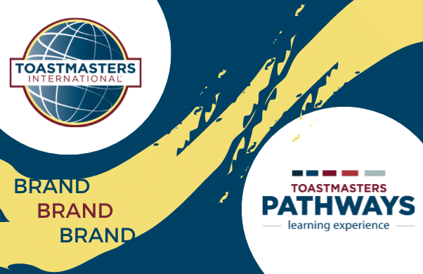

Simple steps to Toastmasters Branding
Branding is one of the easiest concepts to understand, yet it’s one of the hardest to execute.
Branding is our most valuable asset, and it is more than just a logo. It is our identity and our personality. It is key to delivering the Toastmasters brand consistently across all channels, both online and offline.
We’ll aim to provide comprehensive instructions on how to interpret our Toastmasters Brand Guidelines.
Basic principles
Brand guidelines are a vital tool to help ensure brand consistency. Without guidance, our Toastmasters brands can become distorted over time, and potentially damage our brand value and reputation.
The Benefits of using the Toastmasters Brand
The brand will communicate a consistent look and message, in turn increasing understanding and global awareness of Toastmasters International.
It motivates prospective members to join, making district and club objectives easier to achieve.
It increases pride in being a member of Toastmasters.
New for 2024: Centenary of Toastmasters International and 10th Anniversary of District 91
 Since 1924, Blue
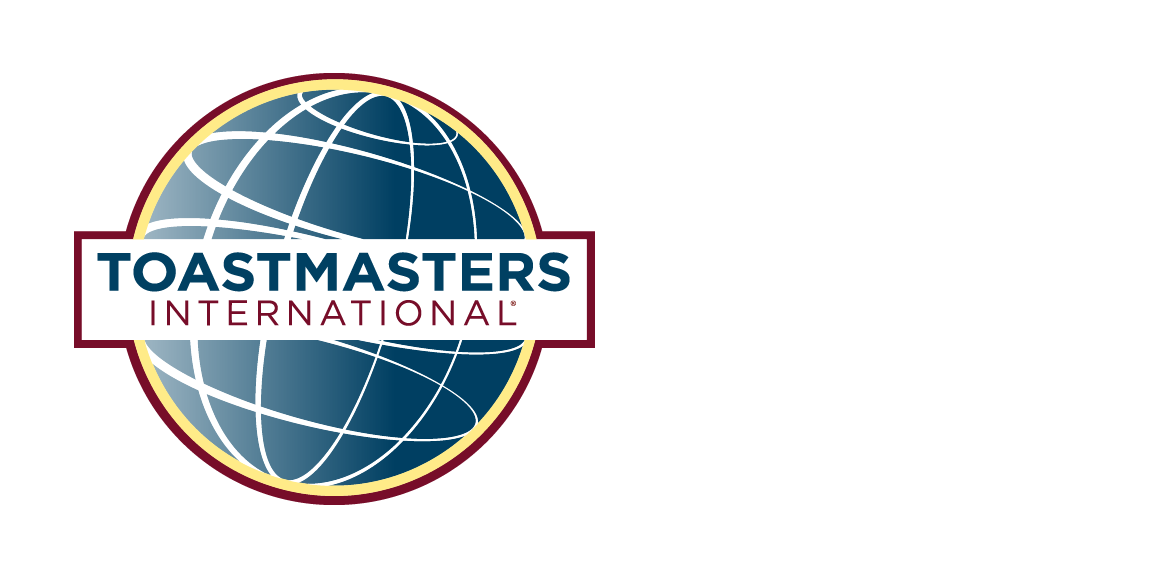 Since 1924, White
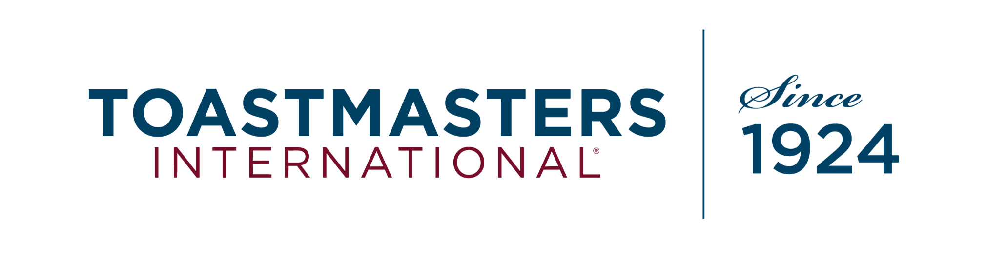 Since 1924, Blue Wordmark
 Since 1924, White Wordmark
We have created a District 91 10th Anniversary emblem that has been prominent in our email footers since the start of our 2023-2024 year. It is paired with a modified version of our District 91 lockup with the globe logo, as “District 91” appears smaller, in the same font and size as “Anniversary”. Please do not use this District 91 lockup in any other context – normally “District 91” is the same width as the logo positioned directly above it.
 District 91, 10th Anniversary 1 of 2, Blue
 District 91, 10th Anniversary 2 of 2, Blue
 District 91, 10th Anniversary 1 of 2, White
 District 91, 10th Anniversary 2 of 2, White
Logos
The Toastmasters International logo is an integral piece of our visual identity. Its correct and consistent application accelerates engagement, raises our credibility and improves brand recall.
It is essential to follow some simple rules when using the Toastmasters logo.
- It should not be distorted in any way
- Ensure there is sufficient space around the logo
- It should not be too close to the text or the edge of the page
- It should be clearly visible for print and web scenarios.
- It can be placed on top of a photograph as long as there is a contrast between the image and the logo.
- It must not be placed on top of a solid block of colour that is not one of the four Toastmaster brand colours.
Which logo to use where and when?
Main Logo
The Toastmasters International logo is an integral piece of the brand’s visual identity. Used properly, it helps to deliver a consistent experience across our diverse and unique clubs, while also improving brand recall.
Primary
Any communication relating to Toastmasters should carry our Toastmasters International logo, our primary logo in the full four colours.
Greyscale
If you have communication where colour is not appropriate then you can use the greyscale logo.
White
Or alternativeely you can use the white logo.
Download the logos from Toastmasters International
Wordmark
These can be used on their own or in conjunction with the Toastmaster logo, it should have a clear space and minimum-size 72 pixels to ensure the wordmark is clearly visible for print and web applications.
 Primary
Use in conjunction with the Primary Logo, to help emphasize the Toastmasters Brand.
 Black
Black
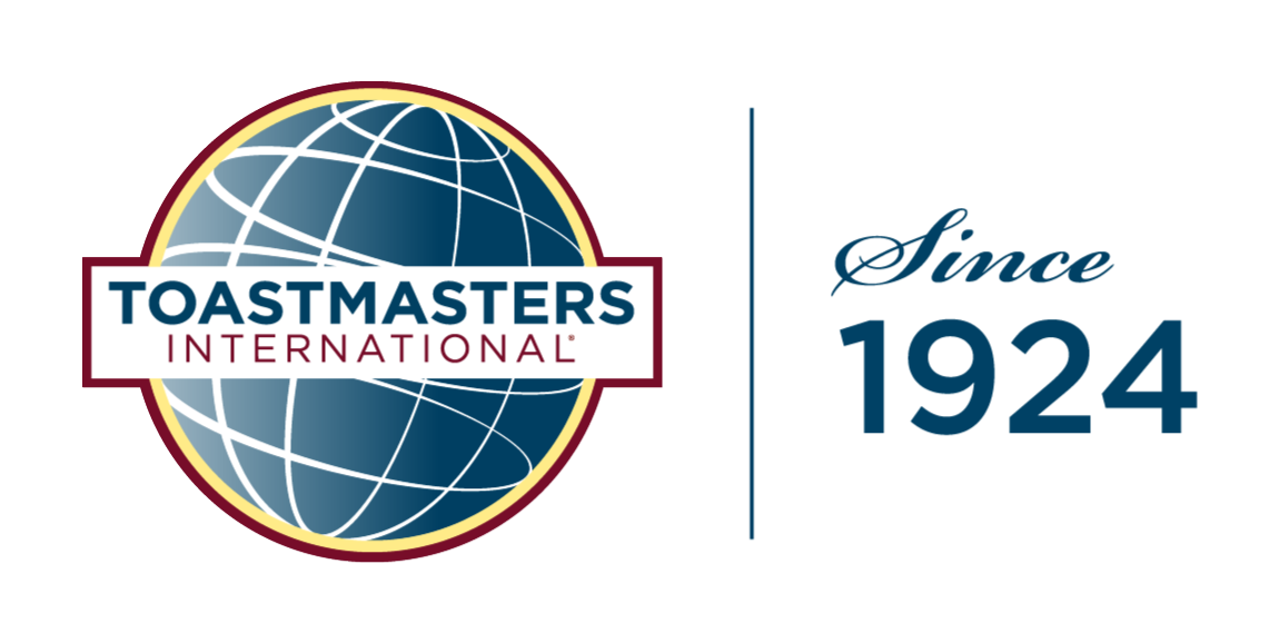
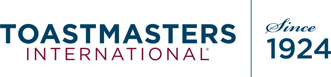 Primary with Since 1924
Use in conjunction with the Primary Logo to help emphasize the Toastmasters longevity.
 Grey scale with Since 1924
Use in conjunction with the Primary or Grey scale Logo, to help emphasize the Toastmasters longevity.
Logo Lockups
If you want to emphasize the Toastmasters website or the longevity of The Toastmasters Brand then you can use some of these alternative logos.
 Primary with URL
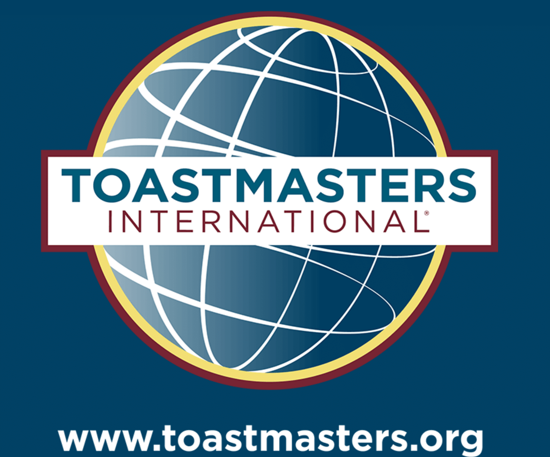
If you are promoting online you can use the Primary Logo with the toastmasters.org URL.
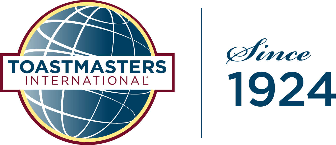 Primary with Since 1924
If you want to demonstrate the longevity of the Toastmasters brand you may want to use the 1924 lockup.
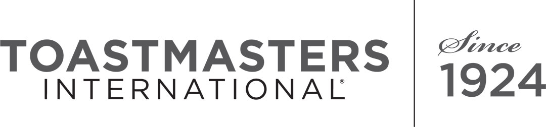
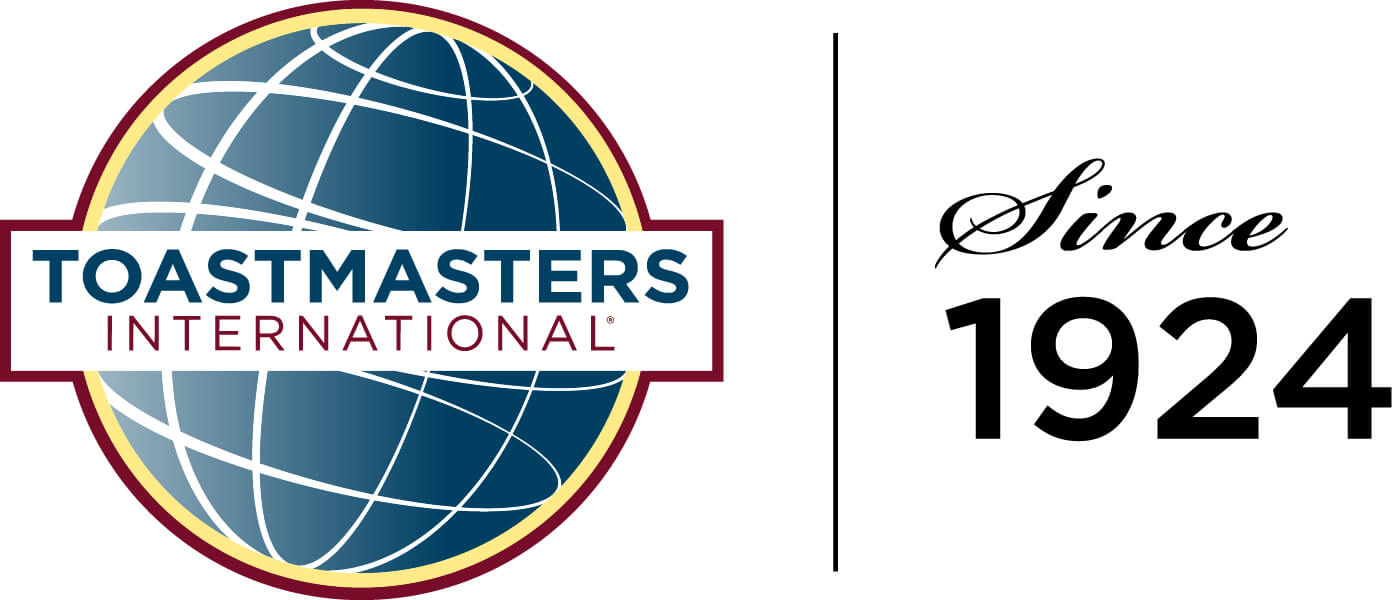 Black with Since 1924
If you want a different style you can use the Primary Logo with 1924 in black.
Pathways Logo
Primary
Use in your club activity when promoting the Pathways education programme.
Colour
These are an expression of our brand identity, and they attract consumers. Colour can evoke emotions, warmth, excitement, and curiosity. When we repeatedly use our brand colours, it strengthens our brand awareness.
Primary colours
There are three primary colours to use for Toastmasters. Blue, Maroon, and Grey. These primary colours help to identify our brand quickly, they can be used in Headlines, Subhead and body copy; they are also incorporated into our logo.

True Maroon
Hex #772432
C12 M95 Y59 K54
R119 G36 B50
Pantone 188

Loyal Blue
Hex #004165
C100 M43 Y12 K56
R0 G65 B101
Pantone 302

Cool Gray
Hex #A9B2B1
C23 M7 Y12 K18
R169 G178 B177
Pantone 442
Secondary Colours
Toastmasters uses secondary colours to help highlight core information, and the yellow can be used to highlight a Call to Action or when you wish to highlight supporting detail.

Happy Yellow
Hex #F2DF74
C0 M5 Y57 K0
R242 G223 B116
Pantone 127
Black and white
Black can be used within copy/text, and white provides contrast and clear spacing and can be used in headlines.
Typefaces
Heading Typefaces
To help emphasize your message we recommend that you use Monserrat for Headlines and subheads
We would recommend you use the Bold and Light style for main and subheadings rather than thin, extra light, extra bold and black as these are less legible to read and more difficult to use.
Do not use capital letters. Rather, you should use a combination of Upper and Lower case as it helps people read your message.
Montserrat Classic
Montserrat Thin
Montserrat Bold
Body Text Typefaces
For third-level headings and body copy we recommend you use Sans Source Pro.
Both these fonts Montserrat and Source Sans Pro are free Google fonts which are web compatible
Images
Images are an integral part of our brand guidelines, images are more than simple visuals—they convey emotion and they can building trust and confidence over time and repeated exposure.
They are an opportunity for us to visually communicate with our potential members and existing member, they show who you are, why we should be trusted and how we will make their lives simpler and better.
When choosing images make use of interesting perspectives that will draw the eye.
Always make sure your images are chosen from a reputable source, and you have checked the rights to use an image.
Use images that are reflective of your club or members.


Audiences
Current Members
Toastmasters International members are our most significant audience because they embody the brand.
It is essential to keep the needs of our current members at the forefront and ensure that they do not feel alienated.
It is important to remember that the needs and ideals of our members have not changed; they have evolved over time.
Potential members
… are interested in personal skill-building. They are the most general audience because they represent anyone seeking self-improvement.